https://go4wardstudio.com/wp-content/uploads/2024/05/Version_2-2.mp4 In a saturated market, standing out is essential. With a clear vision and a passion for her work, Paula Afonso sought a transformation that reflected her essence and vision. This is where we come in. What we did: Logo: The previous logo was updated, retaining familiar elements to preserve the identity while introducing a...
visual identity – eluxe realty The briefing for this visual identity was clear, a minimalist design that symbolizes luxury and exclusivity and an E as main symbol. At Eluxe Realty, luxury is more than just a price point- it’s a level of service where the main goal is to deliver unparalleled experiences in the luxury...
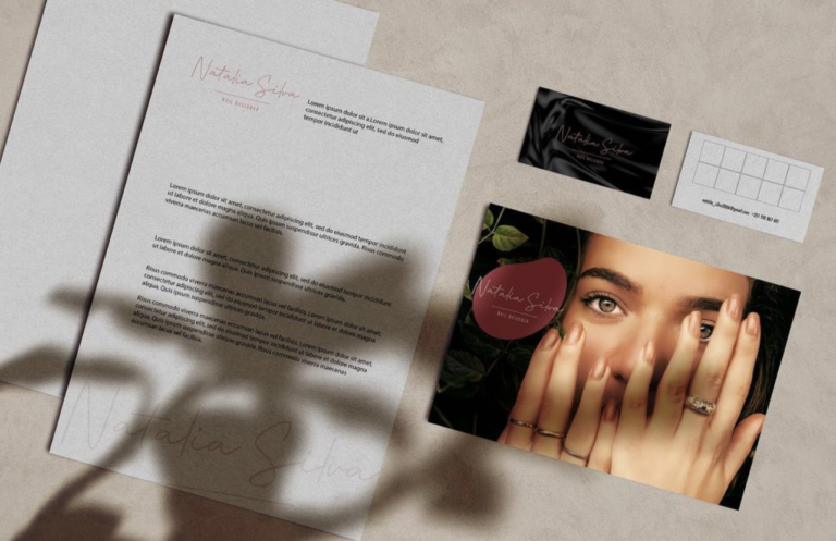
Visual Identity developed for Natalia Silva, Nail Designer.
With Merkaditz, the briefing was clear- the ideal visual identity would be simple with a characteristic element, which enhances brand recognition. Merkaditz wanted to associate the logo and colors with good experiences and happiness, which may not be an easy challenge when we’re talking about such a transactional name. We crafted a lasting impression...


